
Frieze, 2013, truther
§
M said that I should see the power of my outsider position and I said that I could not claim to be an outsider. It was not a coincidence that I was in London now, during ‘Frieze week’. Not earlier or later. I was a conflicted person.
Later I thought about it from a different angle and realized that there was a confidence in me that related to this feeling of being outside in a deeper way. That no matter what connections I made or what I could ‘achieve’ through gaming the art system I would always feel disconnected from its core. That I could never truly buy into it, and that the Art World would always be turned off by the ambiguity of the Warez that I was selling. Was this a promise I was making to myself? Why was I so sure about it? Maybe it was the only way to think that allowed me to continue.
I thought again about the Quaker meeting and about how people seemed beautiful and dignified and a bit scary. Collective will and the search for a higher connection rendered people beautiful.
It was easy to construct this binary: people walking out of Tillmans’s house, the cokehead gallerists and boyfriends of shithead former love interests, the stressed assistants; they weren’t ugly by any means but they weren’t glowing like the Quakers. Art hustlers were grey like the October that enveloped them. Not earth bound but not floating either. A frustrated middle. I always had to idealize one group while shitting on another.
§
(and M says yeah like you shouldn’t read anything into this, nothing exceptional happened here and i’m like yeah that’s true it’s just funny because of the contrast to this whole quaker thing, that i set out to avoid the structure, to do something else, but then to remember about myself that oh yeah i am really thirsty and desperate too and falling flat on my face with that, like this rejection that i live for. like wanting it enough to appear as someone who wants it but not wanting it enough to get it, which will leave me in that awkward middle space where most people reside. so i don’t feel alone at least. one day yr #trending the next day zero likes.)
§
Desperation and hope against all odds, despite all we knew about neoliberal career games: that 99 out of a 100 would lose.
§
My ambition is not mine. It’s what I’m a slave to. People get fooled into unpaid internships, dead end precarious art careers, student debt. The promise is that you are unique, you are worth it. You find out that some people are more unique than others. The economy has gone to shit and is only booming for 0.1%. The middle class will be a historical anomaly. London doesn’t run on wages anymore. Cultural workers are not driven by consumption but by desire for some abstract idea of self-fulfillment and a sense of meaning. How to make people work 15 hours a day in the service of their ‘personal brand’ while they barely make rent. How to make them psychologize their failures quickly enough to not see a larger pattern here.
Everyone’s in debt to the institutions that lied to them and made them self-critical in a paralyzing way (Goldsmiths, etc.). Most already know that it’s a debt they will default on. The promise of self-fullfillment revealed itself to be a ponzi scheme.
from Jaako Pallasvuo's Frieze, 2013
Feeling feels for this and a lot of what Jaako writes about. I can identify with the frustration and sense it all around me, in my closest friends, in artists and designers I follow. There are attempts to ask questions, asking more questions as if the answers are going to come from nowhere. There are other attempts to keep the same strategy intact, only upping the intensity of either their production or the intensity of their self-promotion. I was working with my studio partner on a project recently and we got to a point where things were not working for the client. My worried partner says we need to push ourselves harder, work harder, work smarter. Anger rushed through me. I said we work all the time as it is and couldn't imagine working more than what was already a strange maximum that wasn't really paying off. As much as I agree with Jaako's optimism that I "believe we were the future, that success would find us or meet us halfway at least," I can't see that coming around in any of the structures or relationships that exist to make that happen currently. It's not going to come around because we make a book or assembling a collective that judges the thing we secretly want to ascend to. Repeating the same historical cycle by replacing the status-quo in order to look down on our friends and those that didn't quite make it in. Feeling that our critique was more necessary, our resolve stronger, and our perseverance more important. That is the stagnation of the present and not a future to make art for. And moreover those words; perseverance, resolve, grit, tenacity...those are words given to us to encourage us to compete because there's a narrative of glory in defeating the odds in capitalist societies. They're not our own words. They're the market's.
Another short example. I saw a HuffPost Political tweet the other day that was something along the lines of "This is how you respond to a #truther!" with a link to Noam Chomsky answering a building 7 question from a recent talk he gave. I won't get caught up in that debate but what really interests me is the twisting of language in the term truther. How many times has it been said? How many people have been desensitized to it's meaning? I don't like making an Orwellian comparison but it is there. The inverted word for an inverted world. It's like using an insulting tone to call your friend beautiful. Truther. You truther. You lover of the truth. You faithful follower of the truth. You seek a truth but you will not find it. You fool! That's what it communicates whenever someone uses that term and that should be all the more reason to investigate where the term comes from, why it is being used, and by whom.
JB to JCB
JULIEN BOIVENT — After Noce Blanche, which was an enormous commercial success, you could have had a studio career, or like Rohmer, who you knew well, gone into an intermediate system, creating a parallel economy in film, in which they are financed by their own success and investors get their money back. But you chose to stay out there on the fringe. Was that something you wanted or was it forced upon you?
JEAN-CLAUDE BRISSEAU — It was both. I discovered that a tiny group of “deciders” like having people at their feet, literally. They especially like it when people make great moral declarations, and then are forced to crawl on their knees in front of them. In order to get ahead you have to bend over, and I categorically refused. People thought I would bow and scrape like everyone else. They were mistaken. The bourgeois do that, but not the working class.Purple Magazine #20
CFCF - Music For Objects Process
This past spring we were asked to create the artwork for the companion EP to CFCF's Exercises (released in 2012). Music For Objects was inspired by a short film Wim Wenders put together for Yohji Yamamoto in 1989 titled Notebook on Cities and Clothes. Here's an excerpt from the film to give you a sense of its significance.
The music in the film certainly also seemed to influence the sound of the EP so we began to take a look at the artwork associated with Japanese releases by composers in the mid-late 80s as well as some contemporary Japanese design via the always excellent IDEA Magazine Japan.
At first we focused on representing all of the objects in some equal fashion, but soon found that any one could symbolize the whole idea. Therefore, we chose to isolate the perfume as it stood out as the most loaded object in the group as well as having the most potential for exploration. As we did more research into the meaning behind each object, across cultures, we discovered they all had unique stories that could be brought out into the artwork. A bowl, for instance, could mean the everyday cereal bowl or a ceremonial tea bowl.
The following typographic pieces were designed for the perfume bottle concept.


Two different vector sketches of the initial perfume bottle concept.


Presented here are the final concepts we mocked up for the cover.
HUO to AC
HUO: What do you think of someone like James Lovelock, the scientist who developed the Gaia Hypothesis?
AC: Well, he’s the absolute opposite. He was a NASA engineer, and his dark vision is an engineer’s vision. It’s a machine vision of the world. It’s not about biology. It’s a self-correcting machine that doesn’t care for us mere humans. It’s actually a piece of science fiction for a generation of middle-class liberals who know that their project failed. I mean, this is the other thing we haven’t talked about, which I’ve never really made a film about, because I don’t know how to do it. By the early ‘70s, the postwar middle classes and the early hippies in this country who had originally thought that you really could change the world for the better, become totally pessimistic, almost apocalyptic. Looking at all this, it’s always puzzled me that one of the most privileged, pampered generations in the history of the world can go from optimism to pessimism so quickly. And I still haven’t worked out quite why they’ve done it. Someone like Lovelock produces beautiful pieces of science fiction that both express and seem to scientifically justify that shift towards a dark pessimism that says we don’t even matter as human beings. We’re nothing. It’s as if they became depressed. I think there is some truth in the argument that they’re a generation of total narcissists, and now that they are growing old and facing death, they can’t even conceive of their own death. Instead, they project their own coming death onto the world. They say, I’m not going to die, it’s the world that’s going to die.
HUO:And this is an earlier generation.
AC: Yes, it’s the generation before mine. They’re basically heroes of their time, a time that believed in self-expression as almost a public duty. They are individualists who believe that self-expression is the most important thing. This means that what you feel inside yourself, inside you head, is the most important thing in the world. But if the world is all in your head, then when you die, the world dies with you—it ceases to exist, because you can’t express yourself. Because narcissists don’t have anything beyond themselves, apart from their children, which is why these people are obsessed with their children—they don’t have a trade union or a political party or religion. They know these people will go on beyond their death, but they won’t. On the other hand, people like me who were brought up by old socialists, although I’m not a socialist, what it did instill in me is a strong belief that you work towards something that will go on beyond your own death. I mean, that’s really what you’re put on this world to do.
In Conversation with Adam Curtis, Part I


already-mades
Since the 1930s total mobilization has not stopped; we are still and permanently mobilized within the flux of "active life" (la "vie active"). Being whatever singularities we are like blank pages on which any history could be written (that of Eichmann, that of a great artist, that of an employee with no vocation); we live surrounded by objects that could become ready-mades, could remain everyday objects, or traverse these two states. However in front of these possibilities, in a light sleep, beneath the surface of the real, a spread of advertising slogans and a host of stupid tasks saturate time and space. Until an interruption, we will remain foreigners to ourselves and friends with things.
Parataxis is thus the very form of our existence under a regime said to be democratic. Class difference remains calm, racism stays hidden, discrimination is practiced amidst a multitude of other facts, all flattened on the same horizontal plane of an amnesiac senile present. The images, impressions, and information we receive are a succession of "stuff" that nothing differentiates or organizes. Collage and channel-surfing are no longer separate activities, they are the metaphor for our perception of life. This is why we believe that it is no longer necessary to go one way or another on the death of the author: for if the author as "convention" seems more necessary than ever in the meaningless struggles to protect copyright and in the interviews with creators that infest the periodicals, we no longer even have to ask whether it was ever anything but a convention to serve the interests of power.
Claire Fontaine
Ready-Made Artist and Human Strike: A few Clarifications
citizen-terminals
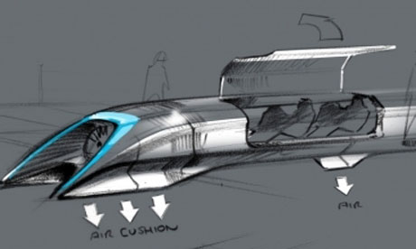 |
| Elon Musk unveiled plans for the Hyperloop in a 57-page PDF |
What indeed is left of the notion of service when you are auto-matically controlled? Similarly, what is left of the notion of public when the (real-time) public image prevails over public space?
Already the notion of public transport is gradually giving way to the idea of a transit corridor, the continuous prevailing over the discontinuous. What can one say about the wired household of electronic domesticity, with houses that have computers wired into them, controlling the house systems, or of the smart building, indeed the intelligent and interactive city such as Kawasaki? The crisis in the notion of physical dimensions thus hits politics and the administration of public services head on in attacking what was once geopolitics.
If the classic interval is giving way to the interface, politics in turn is shifting within exclusively present time. The question is then no longer one of the global versus the local, or of the transnational versus the national. It is, first and foremost, a question of the sudden temporal switch in which not only inside and outside disappear, the expanse of the political territory, but also the before and after of its duration, of its history; all that remains is a real instant over which, in the end, no one has any control. For proof of this, one need look no further than the inextricable mess geostrategy is in thanks to the impossibility of clearly distinguishing now between offensive and defensive—instantaneous, multipolar strategy now being deployed in 'preemptive' strikes, as they say in the military.
And so the age-old tyranny of distance between beings geographically distributed in different places is gradually yielding to the tyranny of real time which is not the exclusive concern of travel agents, as optimists claim, but a special concern of the employment agency, since the greater the speed of exchanges, the more unemployment spreads and becomes mass unemployment.
Redundancy of man's muscular strength in favour of the 'machine tool' from the nineteenth century on. Now redundancy, permanent unemployment, of his memory and his conciousness, with the recent boom in computers, in 'transfer machines', and the automation of postindustrial production combining with the automation of perception, and finally with computer-aided design, enabled by the software market, ahead of the coming of the artificial intelligence market."
Paul Virlio - Open Sky
cybersyn
What do you think will be the content of the “post-capitalist planning” called for in the Manifesto. How would this be significantly different from schemes, not only of GOSPLAN but also of Technocracy, Inc or Italian Futurism?Our conclusion that post-capitalist planning is required stems from the theoretical failures of market socialism as well as from our own belief that a planned system can distribute goods and resources in a more rational way than the market system. This differs from previous experiments with such a system in rejecting both the techno-utopian impulse of much recent writing on post-capitalism, and the centralised nature of the Soviet system.The Speed of Future Thought: C. Derick Varn and Dario Cankovich Interview Alex Williams and Nick Srnicek authors of the #accelerate Accelerationist Manifesto
With regards to the former – we valorise technology not simply as a means to solve problems, but also as a weapon to wield in social struggles. So we reject any Silicon Valley-ish faith in technology – a problem that the liberal left often falls into. On the other hand, we reject any discourse of authenticity which sees technology as an aberration or as the source of contemporary problems – a problem that the proper left often falls into. The question has to be ‘how can we develop, design and use technology in a way which furthers leftist goals?’ This means thinking how infrastructures, data analytics, logistics networks, and automation can all play a role in building the material platform for a post-capitalist system. The belief that our current technologies are intrinsically wedded to a neoliberal social system is not only theoretically obsolete, but also practically limiting. So without thinking technology is sufficient to save us, we nevertheless believe that technology is a primary area where tools and weapons for struggle can be developed.
With regards to the centralised nature of planning, it should be clear to everyone that the Soviet system was a failure in many regards. The issue here is to learn from past experiments such as GOSPLAN, and from theoretical proposals such as Parecon and Devine’s democratic planning. Particularly inspiring here is the Chilean experiment, Cybersyn, which contrary to the stereotype of a planned economy, in fact attempted to build a system which incorporated worker’s self-autonomy and factory-level democracy into the planned economy. There remain issues here about the gender-bias of the system (the design of the central hub being built for men, for instance), yet this experiment is a rich resource for thinking through what it might mean to build a post-capitalist economy. And it should be remembered that Cybersyn was built with less than the computing power of a smartphone. It is today’s technology which offers real resources for organising an economy in a far more rational way than the market system does.
It has to be recognised then that communism is an idea that was ahead of its time. It is a 21st century idea that was made popular in the 20th century and was enacted by a 19th century economy.
INQUIRY PART ONE
INQUIRY PART ONE:
I'M POOR AND I HAVE QUESTIONS.
DO WE HAVE A CHOICE IN BEING CREATORS OF DISTRACTIONS?
HOW LONG ARE WE GOING TO ONLY GET PAID TO MAKE CUTE BULLSHIT?
IS THERE SUCH A THING AS AN 'INDEPENDENT DESIGNER' THAT ISN'T ON FOOD STAMPS?
IS A STARVING DESIGNER REALLY JUST A STARVING ARTIST?
DOES THAT OFFEND ARTISTS?
WHAT HAPPENS WHEN YOU CAN NO LONGER PRODUCE EVEN THE IMMATERIAL?
WOULD YOU GET A PART-TIME JOB AT MCDONALD'S TO SUPPLEMENT YOUR SMALL PUBLISHING LABEL?
WOULD YOU SUBSCRIBE TO A DESIGNER'S IMAGE FEED IF YOU HAD TO PAY A LITTLE FOR ACCESS LIKE A PORN WEBSITE? IS THIS WHAT THE AIGA DOES?
ARE SCHOOLS STILL PROPAGATING THAT GRAPHIC DESIGN IS A CAREER THAT TAKES YOU PLACES EVEN THOUGH YOU'LL BARELY EVER MOVE FROM YOUR DESK?
IS DESIGN STILL AN 'EXCITING' CAREER?
IS ANY CAREER?
WHY DO WE HAVE TO WRITE, DESIGN, AND PRINT OUR OWN WORK ONLY TO SHARE THEM WITH OUR PEERS ON 10 PLATFORMS THAT SAY THE SAME THING?
IS IT ANY LESS AMAZING WHEN WE POST "AMAZING NEW WORKS BY [NAME OF DESIGNER]" A DOZEN TIMES IN A ROW ON OUR INSPIRATION BLOG?
WHAT DO WE MEAN WHEN WE SAY SOMEONE'S WORK IS "INTERESTING"?
ARE THERE PRINTERS THAT WORK ON BARTER/TRADE?
THERE ARE SO MANY
WHY HAVEN'T WE ESTABLISHED MODELS THAT EXIST OUTSIDE OF SERVICING TIRED, OUT-OF-TOUCH MARKETING STRATEGY? BECAUSE THEY HAVE ALL THE SLEAZY MONEY?
HOW IS CRITICAL™ DESIGN DIFFERENT FROM CRITICAL DESIGN?
WHAT'S THE DIFFERENCE BETWEEN A DESIGN SKEPTIC AND A DESIGN CRITIC?
ARE DESIGN CRITICS JUST MALCONTENTS IN IT FOR THE ART MONEY?
HOW MUCH INVESTMENT CAPITAL DOES IT TAKE TO CUSHION A 'SPECULATIVE PROJECT'?
CAN WE START A QUARTERLY KICKSTARTER FOR A GUARANTEED LIVING WAGE?
THAT'S ALL FOR NOW.
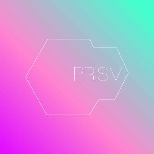
OP003: Where Are Your Ethics? PRISM and Design for Surveillance Technology

This week has been insane. It is rare in history that we are able to feel time shift before us. Many have looked down and noticed this and seen the event for its significance. Others continue on, as if treading water in a pool with an ever-expanding deep end. We now know what we only heard through spooky conspiracy theory circles and the occasional insight from whistleblowers bubbling to the surface. The U.S. Government is monitoring the communication of every citizen in the country and many more people in other countries around the world. While some well paid off spokespeople call for the head of the whistleblower, Edward Snowden, the information he released also brought to light questions about the complicity of Apple, Google, and other tech companies in the NSA's secret surveillance software, PRISM. We may not ever know if their servers had been accessed with their knowledge because a gag rule prevents them from admitting to government requests of information. Zero transparency works in harmony with zero accountability.
Of course, these dilemmas are nothing new to the designer. We've sighed while overlooking the suicide reports from Foxconn, welcoming every Apple launch with drooling envy and some humorous jabs at their reliance on the skeumorphic. We've read about about the astounding number of compliances by Google with censorship requests by the FBI which considers Occupy Wall Street a threat to national security. Still using Gmail. Still love the iconography. And let's not forget the casual pop-in by the FBI director to Facebook back in 2010 asking for access to "easier wiretaps". Still tagging your friends? The difference now is that I think we are starting to feel how compounded these revelations are and they're adding up to a very real ethical problem for the designers working with the technology provided by these companies and the role design plays within these companies.
What this massive data capturing revelation confirms is that for the nine or so tech companies and the NSA it is the meta-content that truly matters. The form on the surface is really just the candy colored camouflage to draw users in and keep them occupied, keep them producing data that can be sold or analyzed. The surface of technology, a thing that many would call "good design" now covers over one of the most corrupt, invasive, and totalitarian info-mining operations ever conceived. Behind a pretty sheen, an ugly deed.
However, the PRISM PowerPoint deck that was leaked to the Guardian is decidedly not so "pretty." Don't fret, though, our design pundits have crawled out of their BrandNew cynicism to call it 'wonky, drunken, and child-like.'
"The slides published from the presentation have been shocking less for their content than their sheer graphic ineptitude."
(Prism: the PowerPoint presentation so ugly it was meant to stay secret by Oliver Wainwright, The Guardian)
In that fantasy world Mr. Wainwright belongs to the bigger story is the 'graphic ineptitude.' Back on earth it looks more like journalistic ineptitude (shocking!). Why does PRISM need to be 'eye-catching?' Has anyone actually asked this? PRISM as a logo is exactly what it looks like; sharp, authoritative, and un-fucking-trustworthy. PRISM as a concept is an ugly sign. A sign that signifies a deep, unsettling ugliness rapidly sliding on a nasty trajectory toward the sort of horrifying totalitarianism we have been warned about countless times by philosophers and historians alike. That's all lost on these amnesiac priests in the cult of neoliberal progress. The priests of this church have found that the form of the PRISM PowerPoint deck is something that simply needs perfecting, it is out of sync with surfaces of desire and consumption and needs to have a proper identity bestowed upon it. You know, something more like the surfaces we interact with everyday. Rounded. Friendly. Dereferentialized. So these sorcerers exclaim "it needs OUR magic." And in taking up the task, the saviors demand that you cite their benevolent work in several articles published around the web. Must link to portfolios. After all what is the point of designing if you cannot be valorized for it? Like. Re-blog. But don't rip me off!
I'm not going to link the designers who unwisely used their time to create these so I'll just refer you to the Gizmodo article that showcases them. The comments are a pleasant insight as well.
The Best and Worst Redesigns of PRISM's Atrocious PowerPoint
 |
| The plan? Gettin' mad government money and kickin' it on the dark side of history as long as they don't find out I bunked with a kid at summer camp that grew up to be a passionate human-rights advocate in his mid-twenties. |
 |
| Why hide behind ugly? The Surveillance State can look as sexy as American Apparel underwear or as full of youthful energy as a dystopian Dubstep rave. |
"As an individual who does work for major government agencies, I often find myself as the only one who bothers to take the time to put at least a little polish on documentation, presentations and any other materials. It's amazing how ugly the vast majority of material can be!
So, uh, I'm doing my part to make the government more aesthetically pleasing!"
(AnxiousLogic, Gizmodo comments)
It is amazing. It's amazing that we're critiquing the ugliness of the vast majority of material of government, but seem unconcerned about how it is barely functioning as a democracy. Maybe some historical perspective will help.
The New York Times published an article back in 2009 about the Bauhaus connection to the Nazi party. In the article we learn about Franz Ehrlich, a former student of Moholy-Nagy, Klee, Kandinsky, and Josef Albers. He worked for the Nazis as a prisoner at Buchenwald where his first task was to design and build the entrance gates to the prison:
"From then on, the Jews, Gypsies, homosexuals and others who were brought to Buchenwald to be worked to death entered on foot under Ehrilich’s elegant rendering of the words “Jedem das Seine”: “To each his own.” It was a translation of a Roman legal maxim invoking the individual’s right to enjoy what is his, but — like the recently stolen “Work makes you free” sign at Auschwitz — recast with a sneer, in this case as a sort of cynical “Everyone gets his just deserts.” The stylish sans-serif lettering reflected Ehrlich’s training under the Bauhaus typography master Joost Schmidt."
(Deadly Style: Bauhaus’s Nazi Connection)
Aside from the irony, this passage sticks out as an important point. The things we design and develop may also be the elegant gates to our own prison. Perhaps it is not always so explicit as polishing a PowerPoint deck that details an architecture of oppression or drawing the blueprints to a gas chamber as another former Bauhaus student turned Waffen SS, Fritz Ertl, was responsible for. As much as we'd like to think we are as imprisoned by our life modes as Franz Ehrlich in Buchenwald, we are not; we do still have some choice about what kind of future we want to live in though it is becoming increasingly difficult to make. As Jacob Applebaum pointed out in his keynote speech at 29C3 (appropriately titled "Not My Department") the solution is not in fighting against these forces or trying to make them work more honestly for us. It is in designing sustainable alternatives. This process starts by asking: Does this thing I am working on help people become more free or less? Does it enable them to become better informed or does it work to deceive them or censor them? Does it allow for more conversation around the issues we face or does it suppress other voices in service of a singular voice? Does this frame information for the repetition of the same social patterns and behavioral interactions or does it open up new pathways? Does it bring us closer or further apart? This is where we should start when discussing PRISM or any re-design thereof. It is how real progress can be made by designers to create a habitable future, not one governed by further exploitation, precarity, and surveillance.
 |
| Not serious. |
“If living unfreely but comfortably is something you’re willing to accept, you can get up everyday, go to work and collect your large paycheck for relatively little work against the public interest and go to sleep at night after watching your shows. But if you realize that’s the world you helped create and it’s going to get worse with the next generation and the next generation who extend the capabilities of this sort of architecture of oppression, you realize you might be willing to accept any risk and it doesn’t matter what the outcome is as matter as the public gets to decide how that’s applied… I’m willing to sacrifice all of that because I can’t in good conscience allow the US government to destroy privacy, internet freedom and basic liberties for people around the world with this massive surveillance machine they’re secretly building.” (Edward Snowden, from his Guardian interview)
The general intellect has gone missing from the designer's considerations as with the rest of society. It doesn't help that publications, such as PRINT, once an effective editorial voice, now glaze over any contextual criticism and gain their share of the data land grab. Having been brought under HOW, their new role seems to be to generate click-bait articles that work more or less like 5 Ways To Tighter Abs; exploiting a depressing design economy and the competitive crisis that has spawned out of that. In short, the body disconnected from the head. This must be re-attached with proper criticism. If not, we'll just keep encouraging more designers to prostitute their work for even less glorification (and for possibly worse apparatus of control), destroying the integrity of an already fragile practice. In this time, maybe we deserve such a clumsy maxim as Good design is design for good. At least that's a start.
Cooper Union and Repulsion
The disturbance or noise or whatever our elder statesman of design are calling the protests occurring this week in the President's office at Cooper Union are only a portion of the total dissatisfaction passing through young students across colleges and universities in the United States. To say that it just happens that this is an art school is foolish. It's just that the Arts are always the first to be thrown into the grinder to be mulched into some more productive occupation. That's really another issue. I'm not going to focus on the issues of the students nor their grievances. Honestly, I'm not familiar enough with them to have an informed opinion [I've also been out of school for 7 years or so]. What I do want to discuss is the vile response from the administration and alumni (in particular, Mr. Glaser), on behalf of some mysterious, fictitious majority. A week or so after this disgusting display of overarching generational warfare, we have yet another savior or tyrant coming to the aide of this selfie-snapping, narcissistic generation. I think it's best to let Mr. Glaser's words tell us how they really feel:
The important diction here of course is "poisonous" and "dangerous." Dangerous to whom, Mr. Glaser? This whole statement comes off as a condescending demand for the student's silence. What I would call a "shut up, slave" moment if there ever was one. If this attitude from the high creative class permeates the classroom, what does it say about that quality of design education? What kind of trust can there be between student and teacher or student and Board of Trustees with such animosity and aggression? Unfortunately, the comments below this petition (on Change.org no less) reveal even more frightening attitudes.
 Josh and 5 others that "liked" his post seem to think this occupation is a criminal act because it is a gesture outside the norms of addressing power. So the students are instantly re-branded perpetrators. They are criminals which either no longer have rights or have limited rights...they would probably say forfeited rights. This is the language of the police. Time and time again we see that the police have become 'society' and 'society' have become the police. Total integration. What isn't clear is what is so demoralizing about the student's position. Whose morality are we imposing here today, Mr. Abend and the others? The morality of mandatory debt? The morality of hedge-fund mismanagement? I doubt we're allowed to discuss those even if the students locked arm in arm are infinitely more aware of how sinister the effects of those are. It seems obvious to me that the students feel they have no other course of action than to occupy the very space which they are not listened to in. Surely design alums (alums that have benefited from no-tuition policies) can understand the value of signs, symbols, and their meaning.
Imagine you prepare for a critique for weeks, stay up for 36 hours straight to finish your project. Yes, you expect some criticism. In fact, you hope for some criticism from your professor and classmates. This is the point, this is how you improve and learn. Then, as everyone comes to your work the professor interrupts and says: This is NOT an acceptable response. Your work is invalid. Is this how design institutions function? By all the undertones in the statement above, the occupation is nothing new. The students are already occupied by a dictatorship which considers their thoughts, actions, and feelings invalid, unacceptable. Perhaps the occupation of the President's office is the only act of resistance that could possibly resonate with the President and Board.


I would also point to Metahaven's interview with Aaron John Peters regarding occupations:
Love and Solidarity.
The occupation of the school has created a poisonous and dangerous atmosphere that can potentially destroy the school forever. It is time for the Cooper community, students, alumni, faculty, staff and all interested parties to indicate their unqualified support of the President and his proposed course of action. [link]
Protests by students are NOT an acceptable response and show an unfortunate lack of understanding on their part.
Imagine you prepare for a critique for weeks, stay up for 36 hours straight to finish your project. Yes, you expect some criticism. In fact, you hope for some criticism from your professor and classmates. This is the point, this is how you improve and learn. Then, as everyone comes to your work the professor interrupts and says: This is NOT an acceptable response. Your work is invalid. Is this how design institutions function? By all the undertones in the statement above, the occupation is nothing new. The students are already occupied by a dictatorship which considers their thoughts, actions, and feelings invalid, unacceptable. Perhaps the occupation of the President's office is the only act of resistance that could possibly resonate with the President and Board.
Such perversion! These students know full well the course of protest suggested above is no longer effective. The protests of the '60s, with their marching and shouting, have been totally privatized. It's evidence enough that you hire police to barricade your uppity 5k marathon around the city. I think we should also give them credit in knowing that any conciliatory solution from President Barucha and the Trustees is a stalling mechanism, a mechanism of power. In Bernadette Corporation's Get Rid of Yourself (2002) there is a part which confronts the thought of protesters as agitators. A pacifist protester says: "My dear, I have been protesting since before you were born, and if we have a society like this, it is also thanks to me."

“We’re not asking for better wages or a lower interest rate. We’re not even asking for the full abolition of capital, because we know that whatever’s next will be something we make, not something we ask for.”Stay strong, students. All students. I commend the struggle you have endured thus far and wish you the best in the continuation against these perverse forces. Your education is your own to make.
Implicit in the text is a recognition that public office holders at the level of the nation state no longer exercise either governmental nor communicative power and that any prospective politics that supplants such actors will be something ‘we make’. There is not just a practical/ political vacuum to fill but embryonic within the form of such movements, built on distributed as opposed to centralised forms of collective action there is a latent ideology waiting to supplant the old ones. These movements, when at their best, criticise the old world in content and advocate a new one in form - hence no demands.
Love and Solidarity.


Taco Talk L.A.

Making the effort if you will. An opportunity to bring L.A. creative people together to talk about the things going on. Anything from design constraints to fugitive ex-cops on the run.
Email me if you're interested in participating.


OP002: For A Good Time Call Sagmeister

OP002 was supposed to be about Weingart's Swiss Typography applied to today's digital context, but I have to postpone that. Believe me, I'd much rather write about that than this.
First, I have to thank everyone that has been discussing the meaning behind the new identity of Sagmeister & Walsh (S&W). We're not spectators, nor is this sport. However, we have stepped off the bench and onto the field (Isn't this what you wanted, Mr. Beirut?). The fear of saying something out of order is exactly what we are fighting against when we speak up and debate the issues that come up in the design practice. And this debate is successful if the parties involved do have mutual respect for one another's thoughts and arguments. The virtue that everyone's opinion is not only welcome but valuable has to be established before a debate can take place.
I must confess I was disheartened to read that Mr. Hardisty does not respect the opinions of those who would challenge his defense of S&W's work. Unfortunate as this aspect may be for our discussion, I must nevertheless dive in.
Here sweetie, burn this CD after you go puke up lunch.
 |
| Sagmeister & Walsh CD, 2013. |
The most glaring problems with the supportive arguments of Mr. Hardisty and Co. deal with visual literacy and the male concept of, well, everything. Including bravery.
Visual literacy is concerned with the anatomy of messages and their effect. The initial thoughts when encountering the visual message above comprised of an icon of a nude woman seated on her knees in front of an icon of a nude man performing a symbolic sexual act are important to interpreting their meaning. In his argument, Hardisty mentions the icons are drawn in a similar way to "1960s institutional graphics" and he's right. These icons are familiar to us, in fact we know these icons quite well. They grace the doors of bathrooms designating the spaces reserved for males and females. They instruct us, guide us, warn us, and they divide us. These icons can be said to be a part of a universal set of codes. Thus, the icon of the nude woman on her knees can be interpreted as representing many women, not just Sagmeister's partner, Miss Walsh. Since we are not provided with any other information in the image besides a name and address, we have an abundance of space for hypothesizing. And that is precisely where the message meets noise and where it becomes problematic. How do other people encounter this image? How would they interpret the image having no knowledge of the other pieces of the identity nor additional signifiers of S&W's practice/history/culture/context?
As visual communicators it is our task to find solutions that are not just bold and concise, but also clear. For me, clarity should be concerned with freeing the work of any alienating, unethical, or ego-oriented details; anything that could distract from the intended message and generate unwanted noise. If the intention, as Mr. Hardisty asserts, is to comment "on [our] not-atypical assumptions" then why aren't we given any other information to let us know that the message isn't asserting that men (who make up the vast majority of the power positions in Advertising agencies and Design studios) are the dominant sex? There is simply too much slack for the viewer to run around with and still enough leftover for some like Mr. Hardisty to find justification for their own ignorance or worse. But it's so easy, argues Hardisty. It's right before us. All we have to do is separate the context (if such a thing can be done) in which we can have our laugh from the other one in which this makes S&W come off like scumbags. These supporters ask us to look beyond how we interpret decades of modernist iconography, look beyond the culture of male sexual privilege (aka I'm the one entitled to use sex), and discover a nonexistent zen-like vacuum of neutrality. The laws of symbols decree that there is no neutrality. It's a war zone.
"The Young-Girl inhabits the Spectacle just like a woman in the primitive world, as an object of Advertising. But the Young-Girl is also the subject of Advertising, exchanging itself. This schism in the Young-Girl is her fundamental alienation. To which is added the following drama: Whereas exogamy effectively maintained permanent ties between tribes, the Young-Girl's mana slips through her fingers, her Advertising fails, and it is she herself who suffers the consequences." (Tiqqun, Theory of the Young-Girl, 76)
It comes as no surprise that intent is absent in the other CD design (below) as well, this time featuring the figure of a woman hung over a toilet presumably vomiting. Is this figure Miss Walsh? Is it Sagmeister? We cannot know and shouldn't infer. What we can infer is that this is again the recognizable icon of woman. We are left to burn like these discs and in doing so we encounter many data errors. One of these errors is that the kneeling woman is a pose that indicates submission. But does she bend to consumer metaphysics or to bad seafood? Taken together with the other disc's image they seem to suggest the norms imposed on women by Spectacle to be young, fit, and attractive; to consume and be consumed. Is it necessary that in all the illustrations the woman is always kneeling to some other power, some ownership of her body? For what purpose? If it is an attempt to subvert these notions then the form is unsuccessful and confusing.
 |
| Sagmeister & Walsh CD, 2013. |
"The deception of porn is that it claims to represent the obscene, making visible the point at which all representation evaporates. In reality, any family meal, any managerial meeting is more obscene than a facial ejaculation." (Tiqqun, Theory of the Young-Girl, 72)I don't think it is in a designer's best interest to ignore the privilege of being a white male in the design practice. After all, the ignorance with which we play our roles as cornerstones of the present system of domination is part of the role. There is no excuse for a male to not be aware of the advantage that they have with respect to the access to tools and resources that enable one to even start a design studio, gain clients, gain notoriety, hire, be hired, fire people, etc. The things that just happen, the obstructions we don't come in contact with, (to use a typographic term) our counter space; that's our privilege. When I worked for a fair sized advertising agency I had to argue against offensive ideas on many occasions. On one such occasion, a writer wanted to name the agency's celebratory roof-top concert series 'Roofies'. As there were no women present in the meeting (like far too many meetings), I felt compelled to disagree with this writer not only because the name was terrible, but because as hilarious as it was to everyone in the meeting I knew it could make the women we worked alongside uncomfortable. I've told this to many of my male friends that work in other studios and Ad agencies and they have jokingly shared similar stories so whatever voice is telling you that this isn't a concern is absolutely wrong.
Brave Old World
Disney released a film last year called Brave. In it, a young girl demonstrates a very different kind of bravery than we are used to. It's not about obtaining dominance, triumph, conquering, or the promotion of the ideals of a war-like society—typically male qualities. Instead, there is a conflict in Brave between sheer physical force – which Merida sometimes demonstrates – and the force of a leader who holds the ethical high ground, embodied by her mother." The bravery that shows an awareness of both sides, of the actions and consequences, is one that also happens to work to shift the system of control and hierarchy. Brave work doesn't enforce, it informs. It doesn't divide and conquer, it brings together. That is why brave is the last word I would use to describe the sale of this position of power back to people as a joke 'you just have to sit with for a while.' There is no confrontation of male arrogance, only a sponsorship of it.
Measure your dick (if you have one).
 |
| Sagmeister & Walsh Pencils, 2013. |
"Modern racism lives in entrenched de facto inequalities, in coded language about "work ethic" and "states' rights," in silent negative spaces like absence and invisibility, and in Newt Gingrich's hair. And in irony." (A Complete Guide to 'Hipster Racism', Jezebel 4/26/2012)Like the irony in printing a scientific "fact" about racial penis sizes on a pencil. As the Jezebel article points out in several places, a joke about the expense of the powerless coming from a position of the powerful more often than not reinforces and validates status quo positions of power. So besides giving into the cult of ethnocentric scientific absolutism (something the Nazis tried), what this pencil also so 'bravely' reminds us of is that the male is still the center of measurable value (and humor) in the office. No man, you don't get it, it's making fun of dudes that think dudes are the center of measurable whatever you just said. To that I say, go lock yourself in a room and don't come out until you have read Sean Hall's A Users Guide to Semiotics. Again the signifiers aren't allowing for one, sanctifying conclusion to be drawn. With that the lead snaps off, splintering across the desk. You flip over the pencil to the other end where no eraser can be found to remove this specific, alienating concept of sexuality that must humiliate other races for the sake of a hypermasculine punchline. By the end of it, is it all really worth it?
That's the big question for me. It is an identity. It is their identity. They chose to represent themselves in this manner. I am choosing to say there is another way. A way out of sketchy ideas and designing punchlines. The first step is to understand the divisiveness that the matrix of mandatory happiness can bring. The next step is to understand that Design can be about so much more than a witty idea, it can be about feelings. As Peter Saville suggests in the Estate book, you can understand so much of what is being communicated from "the typeface, size, position, spacing, and mood." To that I would also add the choice of materials, the texture, the production. It's how punks are able to recognize fellow punks. The language of signs show us what things are about. What does a banal pencil with an inaccurate statistic about men's sexual endowment tell us about the work that Sagmeister & Walsh do?
 |
| A bible for mandatory happiness and an engine for banality. |
So far my criticism has focused on three specific objects of the identity package. I have neglected to offer my appreciation for the condoms printed with S&W's logo. Surely this tells us that they are concerned with promoting safe-sex even if rape and sexual assault in the workplace are the least reported (24%) when compared to other violent crimes in the workplace )Bureau of Justice Statistics).
What I have tried to do here is briefly offer some analysis of the visual representations in order to decipher the motives behind them with the goal of helping others avoid these ethical problems in the future. These problems are so often glazed over with syrupy praise by a loud community of fawning admirers and agents of purification. Many will stay entrenched in such a matrix, an easy to swallow pill of an idea that everything must be cheerful, fun, and witty no matter the cost. Saying things like we shouldn't question other's success because obviously they're successful so "they must be doing something right" is simply hiding in the shadow of economy as ethics. This thinking dangerously ignores the factors that allow for such success in the first place and undermines the progress that has been made so far.
Additional Notes:
1. Preliminary Materials For a Theory of the Young-Girl by Tiqqun. Published by Semiotext(e), 2012.
Tiqqun defines the Young-Girl as an essentially genderless concept. It is about the profiling of citizenry. The homogenization of consumers. Our pacification and our armament. Individual self-control, self-policing taking over for general policing. The control over bodies and behaviors.
2. A Complete Guide to ‘Hipster Racism’ by Lindy West. Jezebel, Apr 26, 2012 1:20 PM.
An all out assault on the weaselly forms of racism embedded in one of the most enlightened, neo-liberal groups of society: The Hipster. Worth reading if you like the thrill of dropping in on that 'ghetto' bar on the other side of town once in awhile. [Link]
3. The Facts on the Workplace and Sexual Violence [Link]
With recent disgusting events in Ohio and rape jokes still finding their way into marketing meetings, its probably a good idea to refresh your mind about the statistics of violence against women in the workplace.
4. Gender And Graphics [http://genderandgraphics.tumblr.com]
A Tumblr that examines gender in Graphic Design. This one is particularly appropriate.
Subscribe to:
Posts (Atom)